Click here to read the new and improved version of this article on Medium!
This article briefly presents the few simple visual principals of the Hebrew language. The examples are mostly set in fonts by Maxim Iorsh of Culmus Project.
Direction
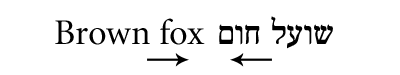
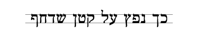
Direction of Hebrew text is from right to left, unlike Latin languages that read left to right.
This affects both the structure and direction of the letterforms.
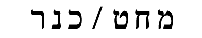
End-Of-Word Letters
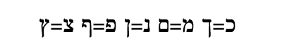
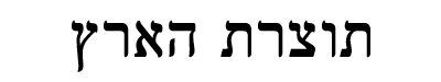
As Hebrew evolved, some Hebrew letters were designated for use only in the end of words.
These letters have seperate glyphs, but in essence, they are "versions" of other letters.
Diacritics
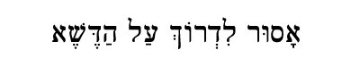
Hebrew vowels aren't letters - they're small diacritic symbols that decorate the letterforms.
Diacritics aren't common in everyday Hebrew, but are essential in text faces.
Unicameral
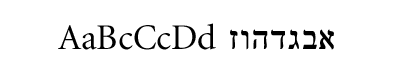
The Hebrew alphabet is consisted of only a single set of letters, unlike Latin alphabets, which are bicameral: they may feature, for example, both uppercase and lowercase letters in one alphabet.
Maqaf
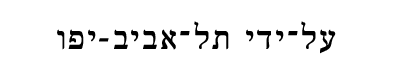
The Hebrew hyphen ("Maqaf") is unique in Hebrew punctuation, because it is used to connect two words to form a single term.
Notice how it aligns with top horizontal strokes.
Period
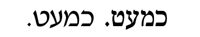
Hebrew period in "Serif" faces usually looks like a tiny tilted square. This is also true for question marks, etc.
Furthermore, traditional Hebrew calligraphy extensively utilizes the shape of the diamond in the alphabets themselves.
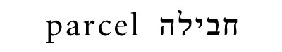
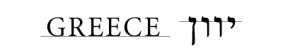
Foreign Characters
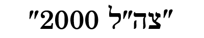
Hebrew uses Western numerals and punctuation, which usually align with the average letter height.
Single quote and double quote are commonly in "typewriter" style.
Ascent/Descent
Only the letter "Lamed" in Hebrew erects beyond the "x-height".
Some letters extend below the "baseline", most obvious are four of the end-of-word letters, and the letter "Kof", but also the "Ayin", in many cases, slightly descends below the baseline.
Strokes
Horizontal strokes in "Serif" Hebrew letterforms are thicker than vertical strokes.
Notice the change in thickness of diagonal strokes.
Geometricity
Hebrew letterforms, unlike Latin, don't conform to simple geometry. In classic faces, there isn't even one completely straight angle!
Note the unique, yet "squarish" nature of the letterforms, which is opposite to the Roman "circle based" shapes.
Letterform Origin
While Latin letterforms can be assimilated to sophisticated architectual constructs, that erect from the (virtual) ground up, Hebrew letterforms are more like wire hangers, that hang from an invisible coat rack.
Width Adjustments
"Closed" letteforms (that have vertical strokes on both their sides) are usually rendered slightly wider, to satisfy human optical perception.
Italics
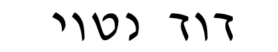
There is no "true" Hebrew Italic style. The closest thing to Italics in Hebrew is the "David Oblique" typeface, which was designed in accordance to ancient semi-cursive scripts, and therefore can be considered somewhat "Italic".
Cursive

The Hebrew cursive alphabet is the Hebrew "script", which is almost always used by Hebrew literates as handwriting. This style of letters looks like a different alphabet altogether, and features a bigger variety of shapes and more roundness.